
Welcome back to Flexibility Is Freedom!
It feels like not too long ago when I quit my job on a beautiful Friday afternoon in Toronto and spent the summer learning about WordPress, SEO, Affiliate Marketing, etc.
Ah, the good days when I had no idea what I was doing knew nothing about the joys of Google algorithm updates or Amazon Associates rate cuts.
(but hey, at least I haven't been hacked yet, fingers crossed)
Anyways, old man nostalgia aside, let's talk about August 2020, the 8th month of a year that just keeps on giving. (that was sarcasm, in case you couldn't tell)
I spent this last month writing 5 new "Best" articles and upgrading some of my existing reviews using a brand new template (along with an awesome plugin WP Review Pro).
I also ordered another 5 guest posts from SEOButler (they had a $20 off sale this month) and added two new brand partners, one of whom has offered me an exclusive discount code and we're now working on a potential guest post in the future.
Alright, now let's actually talk about the results for August 2020.
*Percentage of revenue from Amazon Associates programs
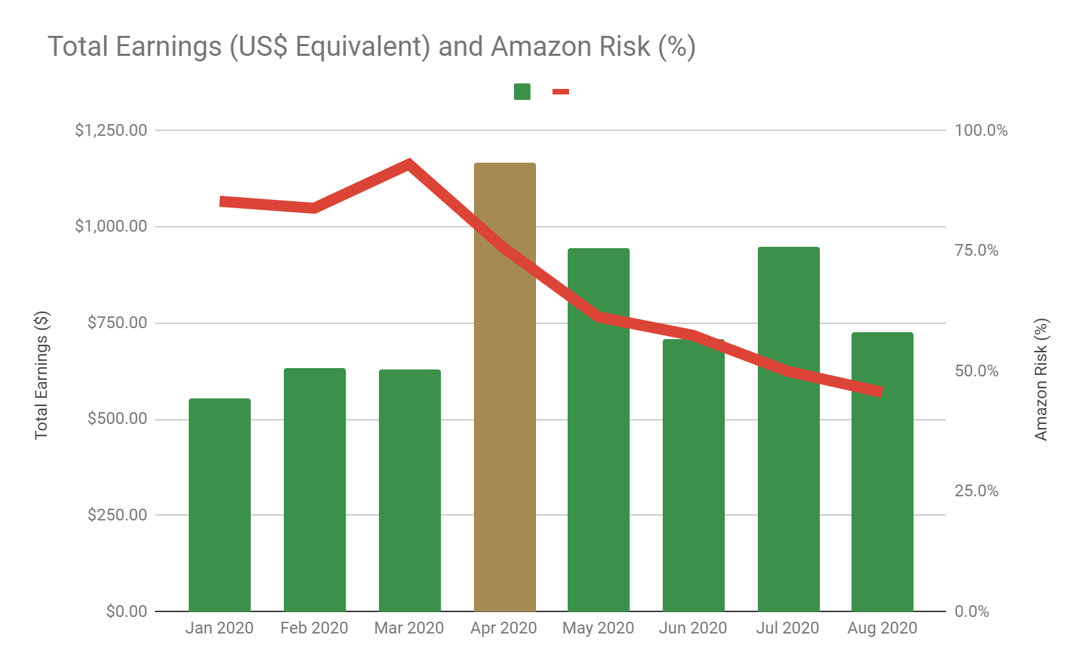
Once again, here's a graph of Earnings and Amazon Risk for the Year-to-Date Period:
And a graph of Traffic and Profitability for the Year-to-Date Period:
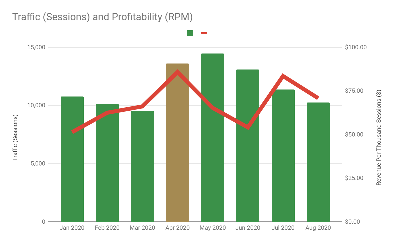
Overall, I was pretty disappointed with the traffic and revenue results this month. I had high hopes that revenue would continue to increase after a strong performance in July.
One of my top posts did lose a ton of traffic in August (despite content upgrades and backlinks) and I've been trying to get it back into the #1 featured snippet spot.
But aside from that, I believe there was a major factor that has most likely contributed to this performance problem: Geniuslink Choice Pages.
Starting in April 2020, after the Amazonggedon 2.0 and Jeff Bezos memes, I began switching out my affiliate links to Geniuslink Choice Pages, wherever possible.
The main benefit was that you're letting users choose their preferred retailer, which could lead to higher conversions and introduce alternative retailers to Amazon.
However, I also recognized that there were downsides to choice pages, namely, you're adding an additional step to the process and users can drop-off before reaching the intended destination (which is a huge waste of all the effort it took to get those users in the first place).
At the time, I thought the drop-off wouldn't be too high and my mind was more focused on diversifying the f**k away from Amazon Associates as fast as humanly possible.
But boy, was I wrong.
Recently, I was shocked to find out that the drop-off rate was 50-70% across all products! (drop off rate is calculated as 1 - the click through rate)
That means more than half of my users are not even getting to the retailer 🙁
You can see in the example below that one of my top products is only getting a click-through-rate of 939 / 1900 = 49% which is a 51% drop-off rate! What the heck!

I compiled this data across multiple products and still got the same results:
(I am using 3 months worth of data so that there is sufficient click volume)

I've pointed this out to the Geniuslink team but I don't think it's actually their fault at all.
From a speed perspective, the Geniuslink choice pages load lightening fast and the entire Geniuslink infrastructure is definitely built for speed (all of my regular Amazon links are auto-affiliated and localized by their servers in milliseconds, barely discernible to the user).
My current hypothesis is that the massive drop-off rates are a reflection of user intent. That is, most users are in the discovery and research stage of their purchase journey and just want to check out the product and price before moving forward.
Placing an additional step and requiring the user to choose their preferred retailer then causes them to lose interest and leave without a click, rather than taking the extra step.
When you ask the user to choose, they may feel they're being pushed into the purchase stage (like an overzealous sales representative in retail) and so they leave instead.
Even so, I have to say that I'm very surprised at how high the drop-off rates have been.
From an economic standpoint, no matter how lucrative your alternative merchants are, it's going to be impossible to make up for the fact that you're losing 50-70% of your affiliate clicks.
That's why I've decided to roll-back this change and revert to using direct links to the best merchant based on the extensive data that I've collected on clicks, sales, and earnings (the one silver lining in this experiment with choice pages).
In many cases, the best merchant is still Amazon and that's okay. I was drawn to choice pages as a means of diversifying but it's not the only method. Smarter decisions on product categories and working directly with established brands are some of the other options.
In addition, Geniuslink has an A/B testing feature that can be used to send traffic randomly to two or more retailers, without introducing a choice page, in order to gather data on retailer performance.
With choice pages out of the way, I hope to see a stronger revenue contribution from Amazon in September as I should have more clicks actually arriving at the final destination.
Another development this month was a mini-design update and the introduction of WP Review Pro, a dedicated and paid plugin designed for review websites.
In terms of the design update, I've moved towards a simpler post layout with a larger sidebar for holding things called widgets like Related Posts, Facebook Like Buttons, Banner Ads, and Google AdSense Ads.
Part of the reason for this is an insight that I picked up from running Hotjar on my most popular posts and noticing that about 10% of users don't even get past the "above-the-fold" mark - basically the bottom portion of where the page first loads!
This may have been due to my extended featured image layout which covers most of the screen (called a Hero Image) but this may be interfering with the user experience.
For example:

So now in my new review articles, I'm using a much smaller featured image with a narrower post layout and breadcrumbs at the top (displays the site structure).
For example:

I've also implemented a rating system using WP Review Pro to create beautiful summary boxes (I built mine based on an existing template) with star ratings for different categories.
For example, in skincare, I've chosen to rate products based on 5 categories:
Here's a recent example:

WP Review Pro calculate an overall score and conveniently implements schema markup (basically, it tells Google that this is a rating) which increases the chances of the score being shown in Google search results (we call this a Rich Snippet and it may increase click-through-rates).
In fact, having schema might also increase rankings and increase the chance of being featured in different snippets, such as the "Critic Reviews" box in a Product Panel.

Finally, WP Review Pro also has a few sidebar widgets that can increase user engagement and encourage users to check out related reviews. I'm using the recent reviews widget but there's also a top rated and category widget as well.

Overall, I think WP Review Pro, along with a new review template based on categories, will make my review articles more aesthetically pleasing, organized, and ultimately help readers find the answers they're looking for.
It's also a good way to increase conversion rates (which are notoriously low on review articles in my experience, ~10-30%) and WP Review Pro includes footer bars and pop-up notifications that I haven't played with yet but would be a good place to put call-to-actions like exclusive or time-limited discount codes, promotions, or other offers (similar to strategies used by merchants).
And the sidebar widgets are a nice touch (although they shift to the bottom of the post in mobile so not everyone is going to see them) that encourages users to browse around.
Finally, I want to touch on a couple of the next steps.
Obviously, I need to fix the choice pages problem that I explained earlier.
In September, I'm going to add Google AdSense to my website and see how much incremental revenue display ads can bring to the table.
Finally, I think the next 1-2 months will be more of the same. I've been getting into the "zone" in terms of producing content at a steady pace and consistent quality. The new review template looks great and I think it will help my website stand out from the more dated and stale articles out there.
In terms of backlinks, I will continue to use agencies, although I recognize that I'm running out of relevant options in their inventory at this point and I also want to reduce my reliance on them.
I'm considering a different approach to organic link building, in the form of "link fishing", or creating a content library/resource that people will naturally link to, like an ingredient dictionary (very popular in the skincare niche) or a series of tutorials and how-to articles.
Enjoy the rest of your summer!
-Tom